Class Projects
IMAGE PRODUCTION
In Intro to Image Production we will learn to create and manipulate photos and videos using photo-editing techniques
Project 1

This is a collage about me.It contains images with the background removed and the colors changed.
Project 5

My pop-out animal picture is a turtle and it can be seen popping out of the water with a shadow and background.

Project 2
This is a Magazine Cover which includes pictures I personally took, uploaded, and designed to make this magazine cover page.
Project 3&4

This is my full logo and it is my initials with my full name inside of it.I also added a little border because it represents me.

This is my abbreviated logo, which is just my initials combined in a neat yet messy box.
Project 6
My pop-out person picture is my friend Ida at the store with brownies and I edited her to be coming out of the aisle.


Project 7

Project 8
This is my panoramic same spot, same view project and I chose to do a open space in the school. With the photos I overlapped them to create a 360 view
My cloning project is multiple photos of me which I photoshopped to make it look like there is five of me in one place.

Project 9

Project 10

Project 11
My close up small project is various pictures of this apple and I remade the full apple using them.
My close up medium is this UNC logo. Similarly, to my small one I took photos of it and them photoshopped them together to make the full logo again.
My different spot same view project is pictures from the gym hall which I photoshopped to make look like it's one very long view.

This is my old-school Christmas card and I made it for my sister. Along with some festive pictures, I hid my sisters face around the card.
Project 12
Projects 13-17
.jpg)
Mirror Artistic

Mirror BodY

Mirror Choice

Mirror Face

Mirror Scenery
These are all my mirror picture projects and for all of them I either mirrored the picture horizontally or vertically. After I mirrored them I also blurred or erased some of the overlay to make it look like it was the original, creating an abstract piece of art or scene.

Project 18
My A to Z project is a collage of 26 different pictures in alphabetical order with an object that represents that letter.
Project 19
.jpg)
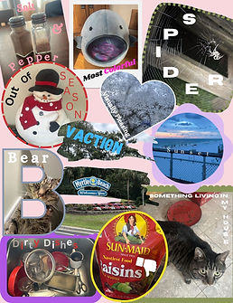
My virtual collage is a bunch of task pictures I took at home or have taken before. Each picture represents something I've seen,I have, I dislike, or like.
Projects 20-23

.jpg)

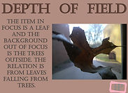
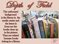
These are my depth of field projects and each one shows an object in focus and the back ground out of focus. All the items relate to their background and I did this by being really close to the object in focus.
Projects 24-29


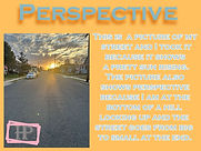
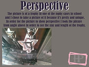
These are all my perspective pictures and to take these pictures I had to take them from different standpoints and angles in order to show the different ways you can view something.

Projects 30-35


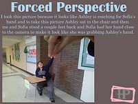

These are my forced perspective projects and for each of them I had to take and think about a photo that would make it look like two objects or people were interacting, but it reality they are a good distance away.

Projects 36-41


These are all my Phone Reflection projects and the three on the left have both the whole phone and object in view and lined up while the three on the right are just the reflection of an object from the phone.

Projects 42-45


Projects 46-49


This is a color contrast and it shows the contrast between the bright yellow and vibrant blue.
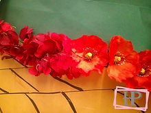
Next, this color contrast is between the red, yellow, and green, which I found on a decorated door in the hallway.
Another color contrast picture I took was of a clear plastic water bottle and a opaque Stanley in order to show a color contrast.
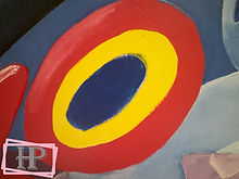
Lastly, the color contrast in this picture is between the bright yellow, red, and blue, which I found on a mural on the wall.
Projects 50-53
These next few projects are tonal contrasts and in this one I am showing a brick wall in the sun versus not in the sun to show the difference.
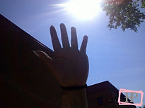
Another tonal contrast I captured was the bright sun versus the dark hand underneath the sun.

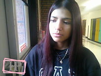
Next, I took a picture of Kamila with half of her face being lit up by the sunlight and the other half not to show the difference.

Finally, like the Kamila's tonal contrast I wanted to see the difference with Sofia's face in the light and dark to show the tonal difference between different skin tones.


The conceptual contrasts are these next picture and this one is contrasting new versus old information because we use technology over books now.
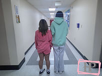
Another concept I thought of was short and tall, so I had Kamila and Belle demonstrate that.
Projects 54-57
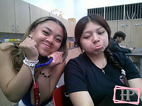
Additionally, I used Ashley and Kamila to convey the contrast between happy and sad.
Lastly, I took a picture of Rowan and the security guard to show the contrast between young and old.

Finally the last contrasting pictures I took were texture contrast and this one is between the thick messy grass and the hard concrete.
The second texture contrast I took was between the rough brick wall and a marble plaque on the wall that is smooth .
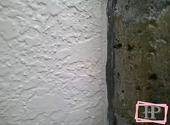
Next, I contrasted the stucco concrete on the wall to the rough hole filled brick wall
To finish this project I contracted my smooth hand to the hard and bumpy brick wall.